The Subtle Paint Trick to Make Your Home Feel Custom
This is a quiet paint detail designers rely on for depth and dimension
If you look closely at a designer space, you’ll start to notice that it’s the subtle decisions that make it feel truly custom. From proportions to finishes, nothing is accidental. One detail that shows up again and again is how paint is used.
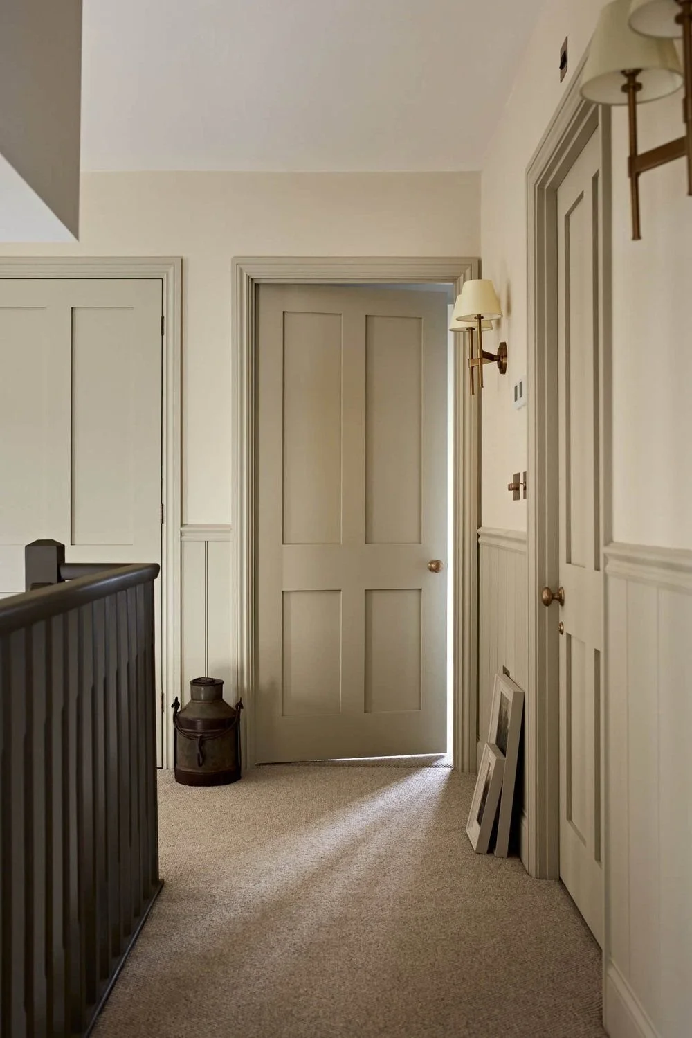
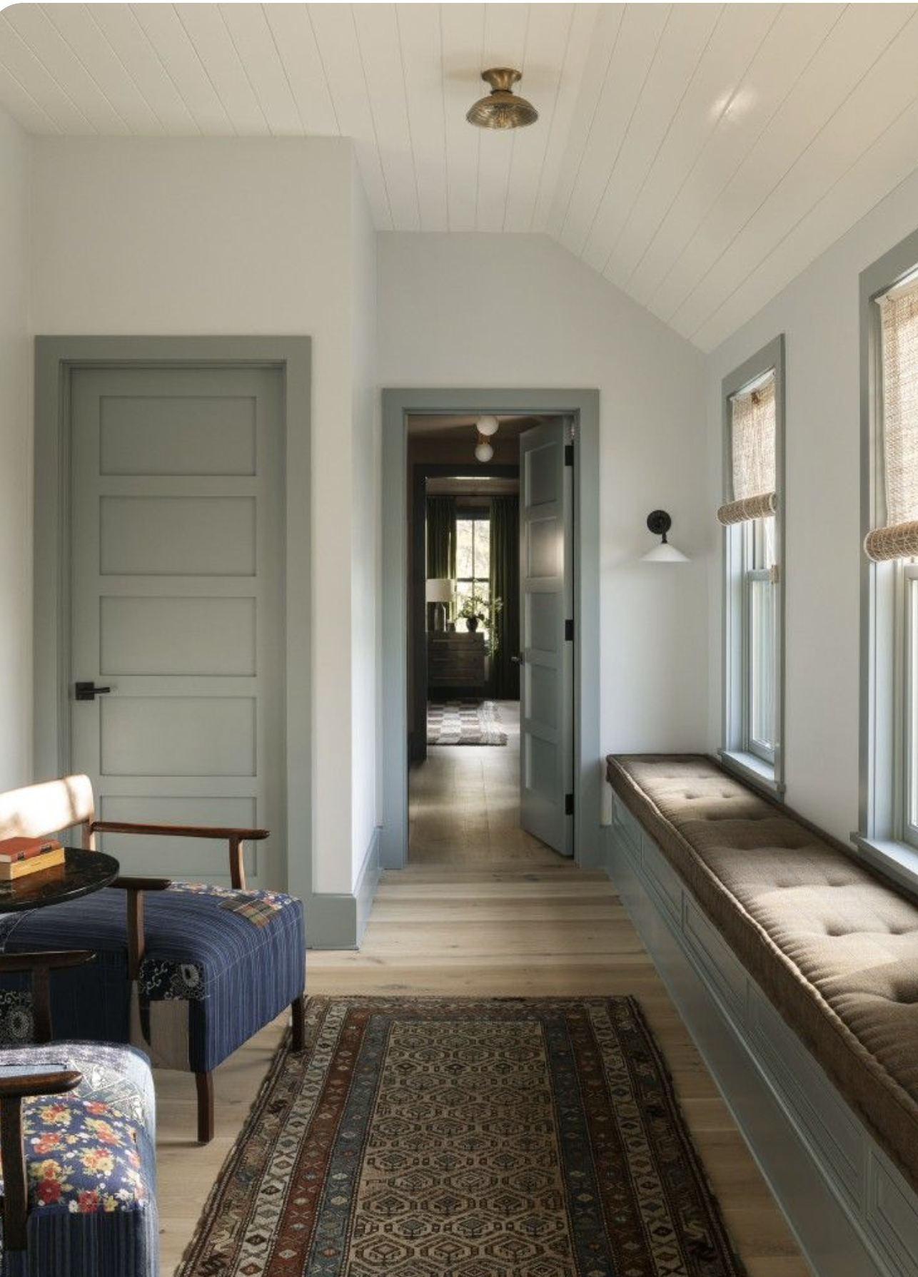
More often than not, the trim and doors are painted slightly darker than the walls around them, adding depth, structure, and that quiet, elevated feel designers are known for.
Credit: Ivy Lane Interiors
This paint trick goes a long way in making a home feel current and thoughtfully designed. It’s especially popular in Modern Classic and Quiet Luxury interiors, where depth and restraint matter more than bold contrast.
When walls, doors, and trim are all painted the same color, a room or hallway can easily feel flat. Separating them subtly creates instant dimension, even before any furniture or decor is added.
The first reason it works is simple. Darker trim and doors frame a space the same way a matted frame surrounds a piece of artwork. Your eye feels grounded and supported, allowing the wall color to shine while the trim quietly does the heavy lifting.
This subtle contrast also adds depth without adding visual clutter. Because the architecture is already doing some of the work, styling feels easier and more intentional. The space looks finished even with minimal decor.
And if your home has architectural details — or you’ve added them through wall molding or paneling — painting doors and this detail along with the trim in trim slightly darker color helps highlight those elements beautifully. Before you even open a door or style the room, the space already feels elevated.
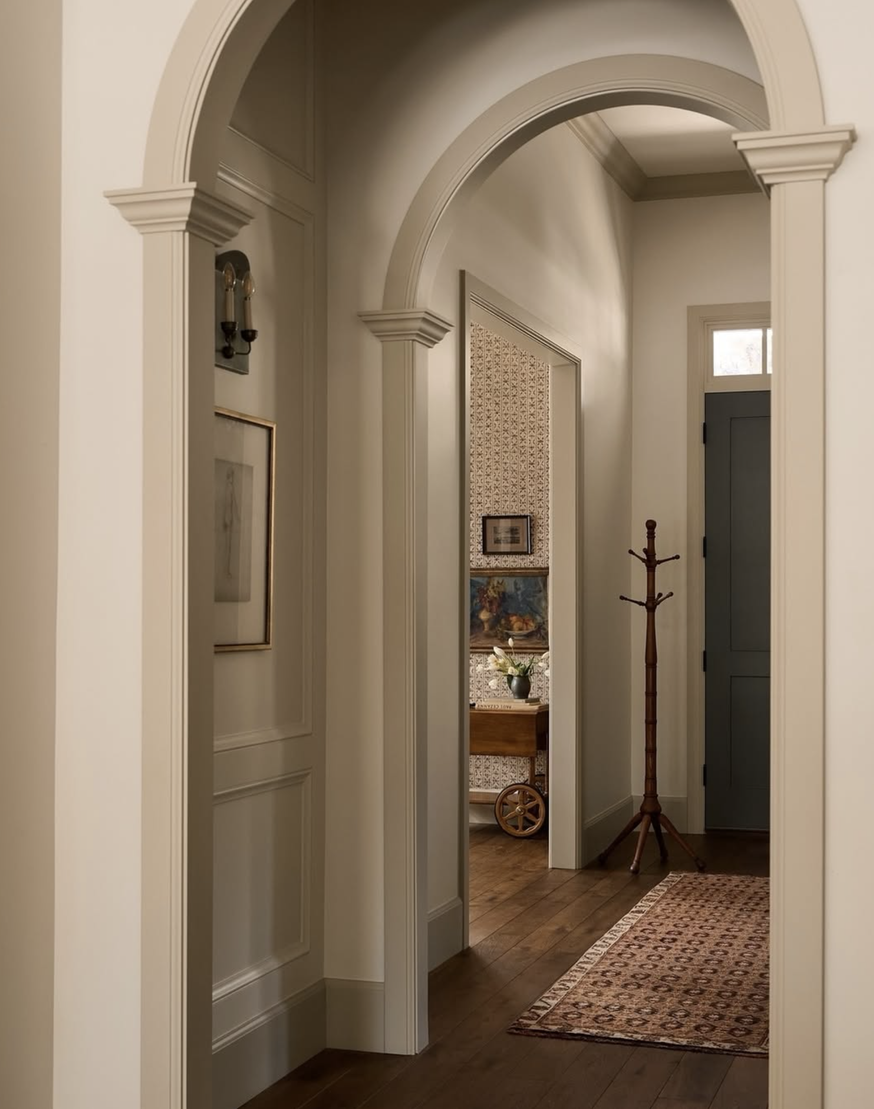
It Works Even in Hallways Without Doors
You don’t need doors for this paint trick to work. In fact, hallways with arches, wall molding, or architectural trim are some of the best places to use it.
In spaces like this, the trim itself becomes the architectural feature. Painting it slightly darker than the walls helps define the passageway, frame the arches, and add rhythm as you move through the space. The hallway instantly feels intentional instead of just transitional.
When hallways are painted entirely one color, all of that detail tends to blur together. By subtly deepening the trim color, you give the eye something to follow. It adds structure and depth without making the space feel heavy or closed in.
Credit: W Design Collective
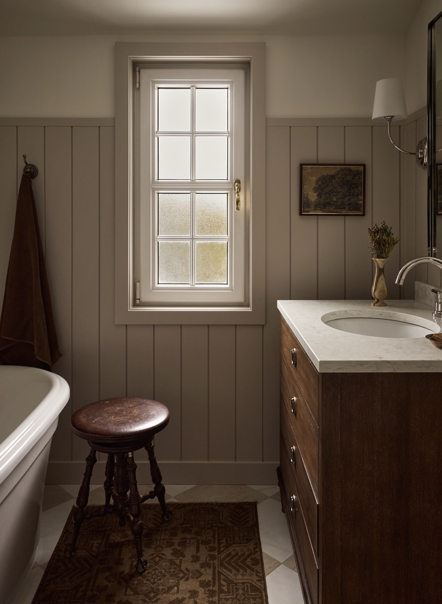
And Pairs Beautifully With Windows
In spaces like bathrooms or hallways, windows can easily fade into the background when everything is painted the same color. A subtle shift in tone allows the window to feel almost like a built-in feature rather than an afterthought.
This is particularly effective when paired with wall paneling or vertical shiplap, as it helps break up the wall surface without introducing contrast that feels too sharp. The window becomes a focal point in a quiet, understated way.
Credit: Blanc Marine Interiors
Via Pinterest
How to Do It The Right Way
If you’re sold on this idea and want to try it in your own home, a few key guidelines will make all the difference.
When painting doors and trim darker than the walls, focus on the lower architectural elements. This means baseboards, door frames, doors, and any wall molding. Skip painting ceiling trim or crown molding in the darker color. You don’t want to visually sandwich the wall from top and bottom.
Keeping the ceiling trim the same color as the walls allows the space to feel taller, calmer, and more cohesive. The darker elements below feel grouped and intentional, rather than heavy.
When choosing paint colors, restraint is everything. The trim and doors should not be dramatically darker than the walls. Instead, pick a shade that is just slightly deeper and within the same color family. This creates contrast without drawing attention to itself.
Think of it as a contrast you feel, not one you immediately see. If the difference jumps out the moment you walk into the room, it’s likely too strong.
The only time stepping outside the same color family makes sense is when you’re working with a very intentional color story. In spaces with a strong, cohesive palette — like this one below, where deep, muted blues are used throughout — choosing a dusty blue for the doors and trim feels natural and grounded. Because the color is already echoed in the furniture, textiles, and overall mood of the space, it feels thoughtful rather than random.
Via Pinterest
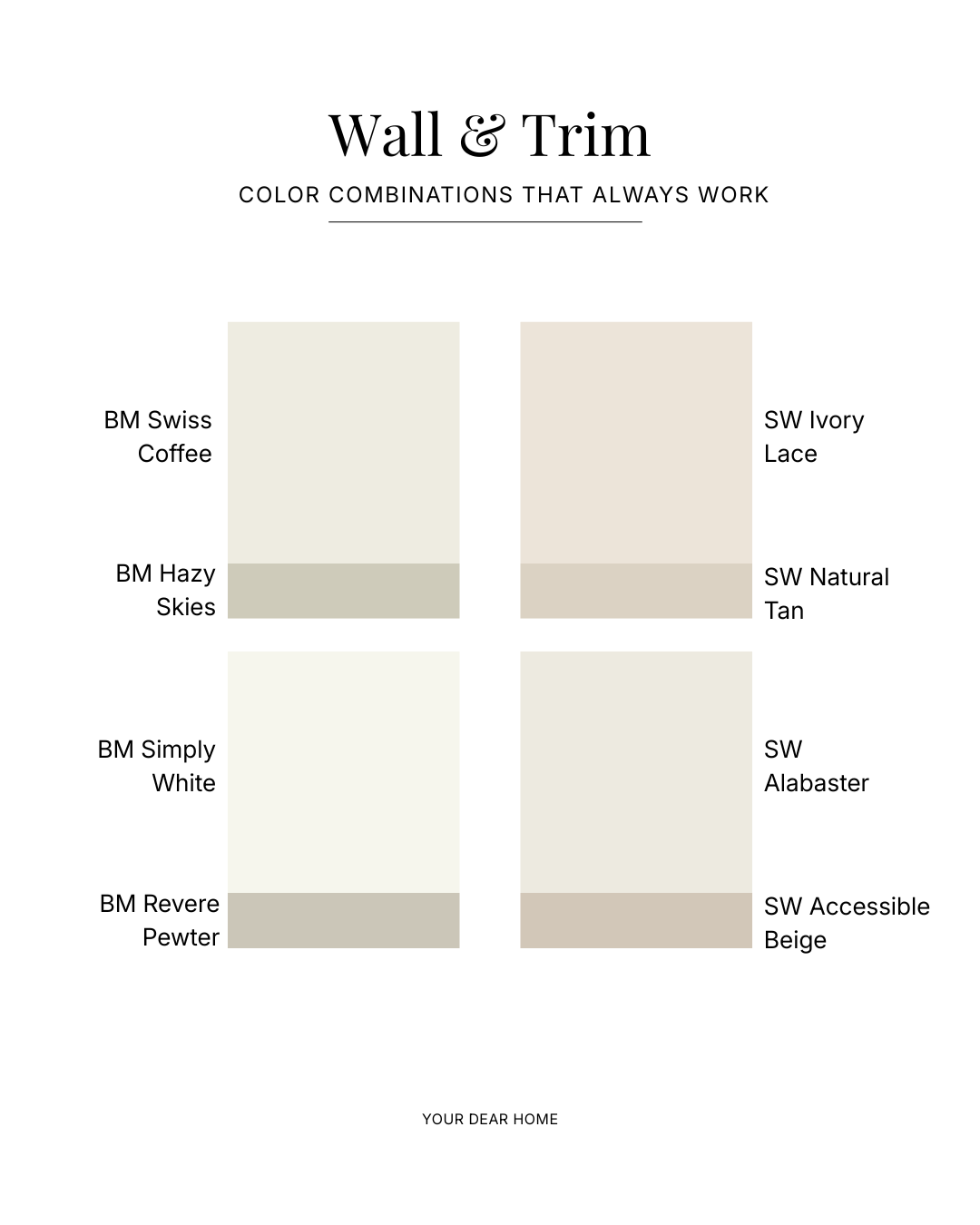
COMBINATIONS THAT WORK VERY WELL
Let me save you some time experimenting and share a few paint combinations that work beautifully in real homes.
If there’s one takeaway here, it’s this: a custom-looking home isn’t built on dramatic choices. It’s built on subtle, well-considered ones. Using paint to define walls, trim, and doors is a simple shift that adds depth, highlights architecture, and makes your space feel designed rather than decorated.